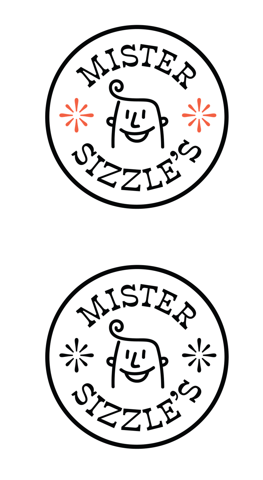
MISTER SIZZLE'S
Branding | Naming, Visual Identity, Brand Activation
Mister Sizzle's is a new fast food joint immersed in a fun, simple, and tasty
brand world. The name and brand elements were all designed for a Buffalo
locale in mind, for those who appreciate a homegrown brand.


A DELICIOUS, FLUID BRAND
For Mister Sizzle's we set out to make the brand feel clearly expressed, appetizing, and friendly. Inspired by retro fast food joints, the brand communicates its bold and iconic energy across type, color, and illustration.


Black is used liberally with the addition of two hero colors. The hues speak to lashings of ketchup on top of a mound of fries, a juicy burger with a spot of mustard, and a creamy minty green, the color of a grasshopper cocktail, or mint milkshake.
360 touchpoints


By showcasing the modular brand in a variety of substrates and mediums, visual interest and whimsy becomes a common theme in all of Mister Sizzle's activations.


