top of page
ZOCDOC REBRAND
Clio Award Winner | 2016
Zocdoc is designed to solve patient problems. Given the start-up's growth, the brand was in need of a stronger point of view. With Power to the Patient as our rallying call, we teamed with Wolff Olins to create a design system that was people friendly and interactive..
Previous Brand Visuals


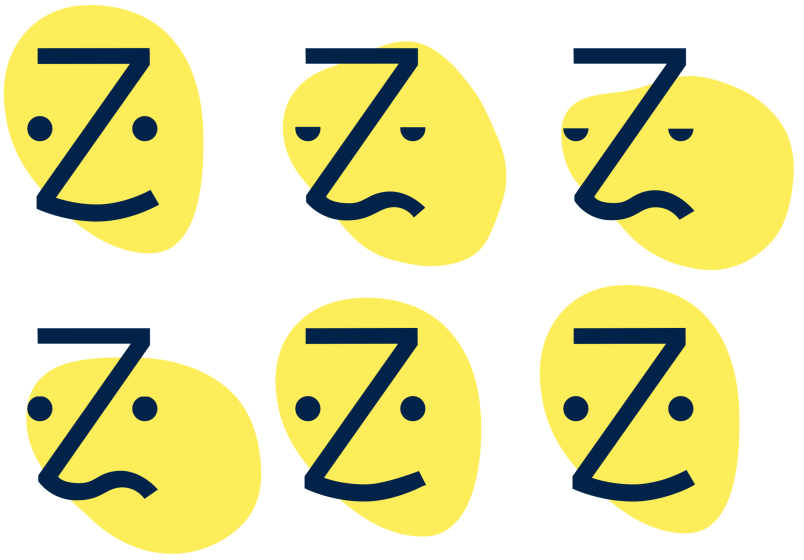
MEET ZEE—THE FACE OF HEALTHCARE


A library of expressions were designed for added flexibility in the identity system. These expressions were animated in the booking flow as appointments loaded, communicating the patient journey.

COLLATERAL


PRODUCT AND WEB


THE DIGITAL HEALTHCARE MARKET PLACE
Creating value not just for patients but providers and larger health systems is an important part of the Zocdoc equation. Teaming with the VP of Marketing we set out to create B2B experiences that highlighted the value and tiers of offering.

EXPLORING A NEW LANGUAGE


THE FINAL DIRECTION


After setting the standard for our illustration style, I worked with an outside agency to animate a video that explained how Zocdoc works.
OUR STYLE IS CONVERSATIONAL, IDIOSYNCRATIC, AND SMILE-INDUCING


CRM


bottom of page


